COVID-19 and Digital First
COVID-19 is creating a “new normal” for so many businesses. Malls look like ghost towns and local businesses are struggling to survive if they haven’t closed already.
Responsive? Adaptive? What are you crazy geeks talking about?
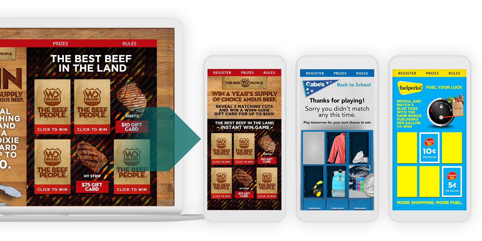
There is a method in website design and development called “Responsive Design”. What this means is that the content will shrink down in a clean way to fit on a phone. This works great most of the time. However, there is another method called “Adaptive Design”. Adaptive design still senses the type of platform and adjusts, but instead of just “shrinking things down”, an adaptive design uses an entirely different design to make certain that the experience on a mobile device is designed explicitly for that device. Yes, we pride ourselves on using Adaptive Design on our promotions platform.
Here are a few of the benefits to trying this kind of promotion:
1. Optimized Experience – The Adaptive Design really allows the promotion to be designed “mobile first” and make that user experience much better on mobile devices.
2.In-Store Elements – Adaptive Design isn’t just about making the mobile experience “look pretty”. Promotions often interact with in-store elements such as signage, QR codes, coupons and so forth. The experience need to be intuitive and efficient to convert promotion entrants and promote sales right there in the store.
3. Sales – Tracking mobile vs desktop usage in a promotion can give you important clues about your audience. Are they finding out about your promotion while sitting in their home office? Or are they in the store and attracted to your offers as they are shopping?
COVID-19 is creating a “new normal” for so many businesses. Malls look like ghost towns and local businesses are struggling to survive if they haven’t closed already.
Take your brand for a spin!
Want the full experience?
Enter our “BE YOUR BRAND SUPERHERO” Spin to Win Game. Try it live and win actual (virtual) prizes see the entire game in action!
We have many samples of our work, details on our promo solutions, promotion flows and you can even win (virtual!) prizes by trying out our instant win games!
Ready, Set... Promo! | PO Box 230850, Las Vegas, NV 89105
© 2023 Ready, Set... Promo!